This week’s Diva Challenge is to use the tangle noom. I’ve used it once before, in the post where I talked about ZenAgain, but there was so much else going on that I didn’t even mention it. Can you find it?
Noom is a lovely tangle, but it hurts my brain. I feel like it is one that I will forever be referring to the step-outs. Even as I was working on this piece, I started one without reference to the steps-outs, and it is slightly different than the others.
Since I was supposed to be working on writing up the instructions for the “Pointing the Way” class, I wanted to use some of the same tangles and techniques that I will be teaching in that class.
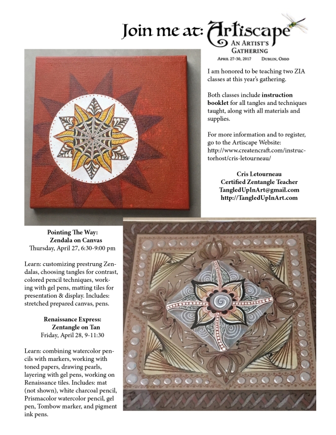
So, I knew finery and colored pencil would be a part of it, along with noom. I was trying to replicate the colors in the original Zendala, but I had just seen a video that using complimentary colors can make your art seem more vibrant. And I didn’t want to have to order six different pencils that I did in the original, so it was time to experiment. This is what happened:

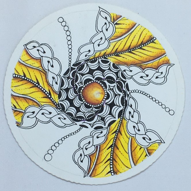
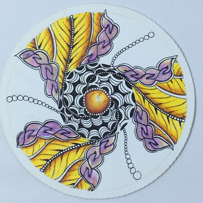
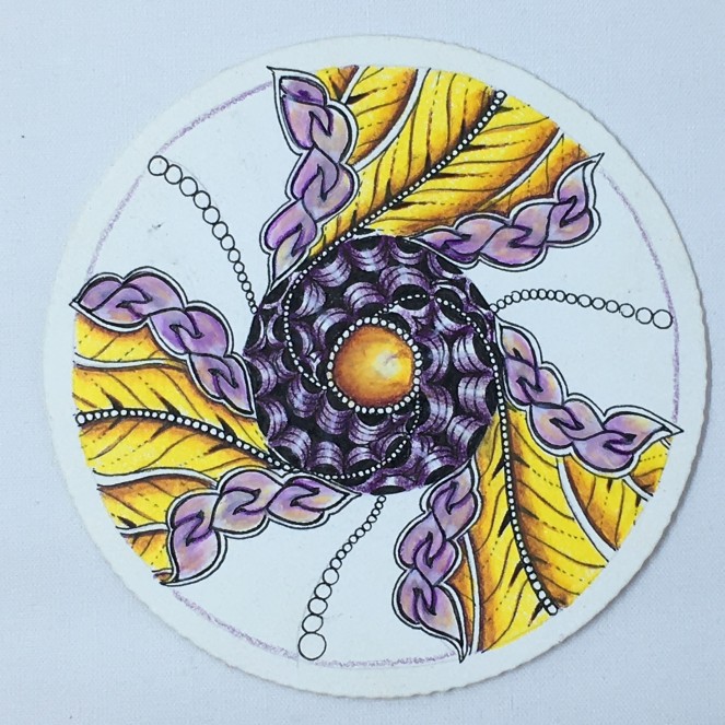
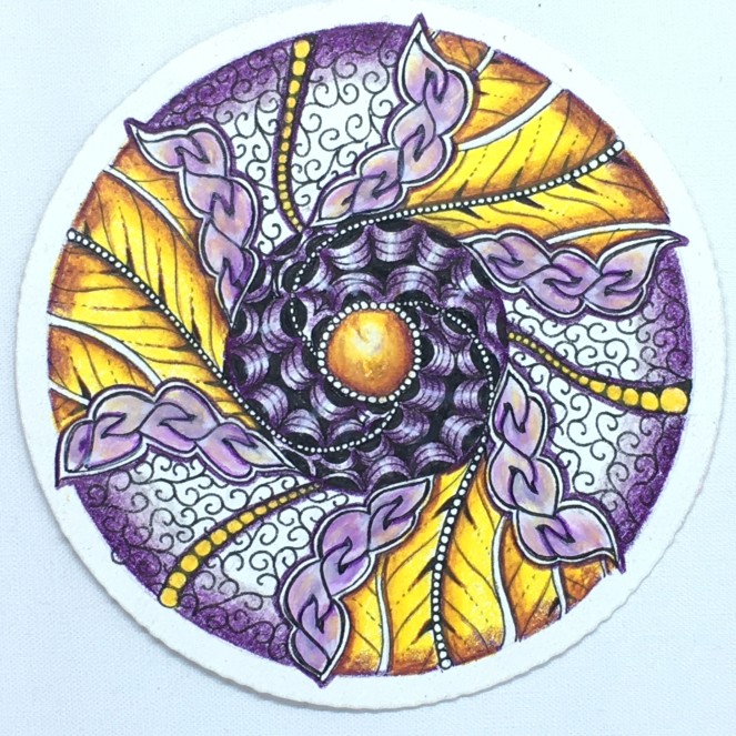

Can you tell from the photos how much more vibrant the glow is on the finery between the two Zendalas? I was delighted with the result. I am now a big fan of this technique and can’t wait to teach it.
Now, off to write up the class notes.
PS- if you are a follower of my facebook page, you might have noticed (or probably not if you don’t receive notifications), that I’m having a bit of a contest about this Zendala. And I just gave you two really big clues. Good luck!

Your work is beautiful!
LikeLiked by 1 person
Using complimentary colors does really make a huge difference when you want to make sure everyone is awake! This is really pretty and I like the way you used Noom almost like a vine in your composition!
LikeLiked by 1 person
Lovely! 😍
LikeLike
Thank you for sharing your process. Oddly maybe, I think my favorite is the one with just the yellow leaves and gem and the dark purple veins.
LikeLiked by 1 person
I almost stopped there 🙂
LikeLike
Wow! That zendala is awesome! Purple and yellow is one of my favorite combinations and I never use it! Back when I was in art school it was all over my work. Thanks so much for sharing your process. I’m most happy to see how you finish each section of Noom. I could only ever see it as a border or a strand running off the tile. Beautiful work!
LikeLiked by 1 person
Thanks. But, my noom is exactly a border that runs off the tile 🙂 Guess great minds think alike…
LikeLike
Thanks for sharing the steps to this beautiful end result!
LikeLike
Thank you for sharing the process, I can learn so much from this beautiful composition!
LikeLiked by 1 person
Amazing work! Many thanks for sharing the process!
LikeLike